Forest meditation app
Goals & challenges
- Thesis project of the UX & Product Design postgraduate programme (edition XIX), AGH University of Krakow, with a real partner organisation
- Research question from the partner, Las Na Zawsze foundation: how to encourage donors to support forest protection regularly and long-term
- Forest protection needs stable funding, while giving is shifting from regular support to spontaneous, one-off gestures
- No prior product to improve: the solution and its format had to be found through research
- Team of 3, 12 in-depth interviews, a 7-person cultural probe and 5 usability tests, delivered within one academic edition
- Foundation's business goals (regular income) had to be balanced with an app that doesn't overwhelm users
Solutions & successes
- Full Learn → Design → Measure cycle, done together as a team of three: research, strategy, prototype and tests with 5 users
- Reframed the problem: instead of asking for donations, build an emotional bond first - a meditation app with sounds of the foundation's forests
- Narrowed to 2 priority personas after a first strategy attempt hit a dead end
- Freemium model: donating unlocks premium features, so requests for money become value for supporters
- 5 changes after usability tests, all aimed at the foundation's goal (regular support)
- Recommendations for next iterations, including monetising forest bathing and a sound library per forest
- Thesis defended with distinction
Process
Step 1: Learn
- Research plan with 12 questions
- Desk research
- 12 in-depth interviews in two groups
- Cultural probe in the form of a tree-shaped paper zine
- 4 personas and a Job To Be Done
- Competitor analysis across 3 types
Step 2: Design
- Object-oriented UX mapping
- 43 user stories
- Prioritised with five Kano-style matrices
- Scenario mapping instead of plain user flows
- Companion service concept: city boxes
- Mobile app screens
Step 3: Measure
- Moderated think-aloud tests, live and online, 5 participants
- 5 changes after usability tests
- Recommendations for next iterations
Key decisions
Went back a step when the first strategy stalled
Customer journey maps for all four personas led to one idea: a website with proof of credibility and easy payment. The maps reflected only what happens after someone has already decided to give, and had no emotional starting point. After a few days we spotted the flaws, switched to Value Proposition Canvas and, together with cultural probe answers, unblocked the strategy
Decision 01 in detail
Step 1: Attempt 1: customer journey maps
The maps reflected only what happens after someone has already decided to give, and had no emotional starting point
dead end
After a few days we spotted the flaws:Step 2: Attempt 2: value proposition canvas
together with cultural probe answers, unblocked the strategy
breakthrough
Designed for two personas, not four
Trying to serve every persona at once was the reason for the stall. We prioritised the two digitally fluent, overstimulated city dwellers - the most flexible for a digital solution - and left the business and mature donors for later. This turned the idea into a calm "forest in the city" experience instead of a climate-guilt campaign
Balanced the foundation's goals against a calm app
The first version had only a few gentle donation prompts. Confronted with the foundation's business goals, we added more conversion points and chose freemium: free basics, premium after supporting. Tests then showed which prompts worked - people support willingly from a specific forest's profile, and ignore generic banners
Decision 01 in detail
Step 1: Attempt 1: customer journey maps
The maps reflected only what happens after someone has already decided to give, and had no emotional starting point
dead end
Step 2: Attempt 2: value proposition canvas
together with cultural probe answers, unblocked the strategy
breakthrough
Discovery & research
- Research plan with 12 questions grouped around motivation, trust, habits and payments; purposive sample, risks identified up front (e.g. people say they support forests but don't act)
- Desk research: giving reports, NGO sector reports, the foundation's own donor data and communication, competitor analysis
- 12 in-depth interviews in two groups: 6 foundation donors (3 individuals, 3 business) and 6 non-supporters. One team member also joined a tree-planting event to understand the foundation first-hand and recruit
- Cultural probe in the form of a tree-shaped paper zine, 5 days of short creative tasks, 7 participants - to reach emotions that interviews miss
- Coded the findings on a spectrum of attitudes, built 4 personas and a Job To Be Done: support forest protection effectively, so that I and my children can be in touch with nature
- Competitor analysis across 3 types (direct, indirect, distant): trust is built on evidence, fundraising simplifies the CTA, emotion and storytelling drive giving
in-depth interviews
participants
cultural probe
personas
user stories
18 for the MVP
usability tests
Insights
- 01
Forests mean calm and relaxation;
a personal bond with nature makes people more willing to give
- 02
A sense of real impact and visible progress
towards a shared goal builds loyalty
- 03
Decisions to give are emotional,
and people prefer subtle, non-intrusive communication
- 04
Transparency about where the money goes
builds trust
Product design
- Object-oriented UX mapping to remove duplication and set the hierarchy (meditation, forest, forest bathing, payments, favourites, emotion journal and others)
- 43 user stories (app and city-box service concept), 18 selected for the MVP
- Prioritised with five Kano-style matrices (e.g. encourages support, builds bond with forests, motivates regularity) against implementation cost
- Scenario mapping instead of plain user flows, to capture intent, hesitation and alternative paths
- Companion service concept: city boxes - sensory forest cabins in cities as a marketing driver. Not part of the MVP, kept as part of the service design
- Mobile app screens: onboarding, home with quick meditation, forests list and map, favourites, support and payment, profile
- Calm, minimal UI in deep green; quick meditation on home, donation prompts lower down
- Payment: preset amounts with a "most chosen" badge, minimum 10 zł, a visual of impact in trees
Usability testing
- Moderated think-aloud tests, live and online, 5 participants aged 19-45 (visited a forest in the last 6 months, supported an NGO in the last 12), two weeks in June 2026, on a Figma prototype
- Covered onboarding, meditation setup, payment, forms of support, paywalls and favourites
- Worked: onboarding and the map encouraged exploring; the premium paywall was understood; impact shown as a number of trees was clear
- To improve: people support willingly from a forest profile but ignore generic banners; pulsing pins and the "active campaigns" filter didn't invite clicks; the post-session video appeared too suddenly; favourites tiles confused users
Changes after testing
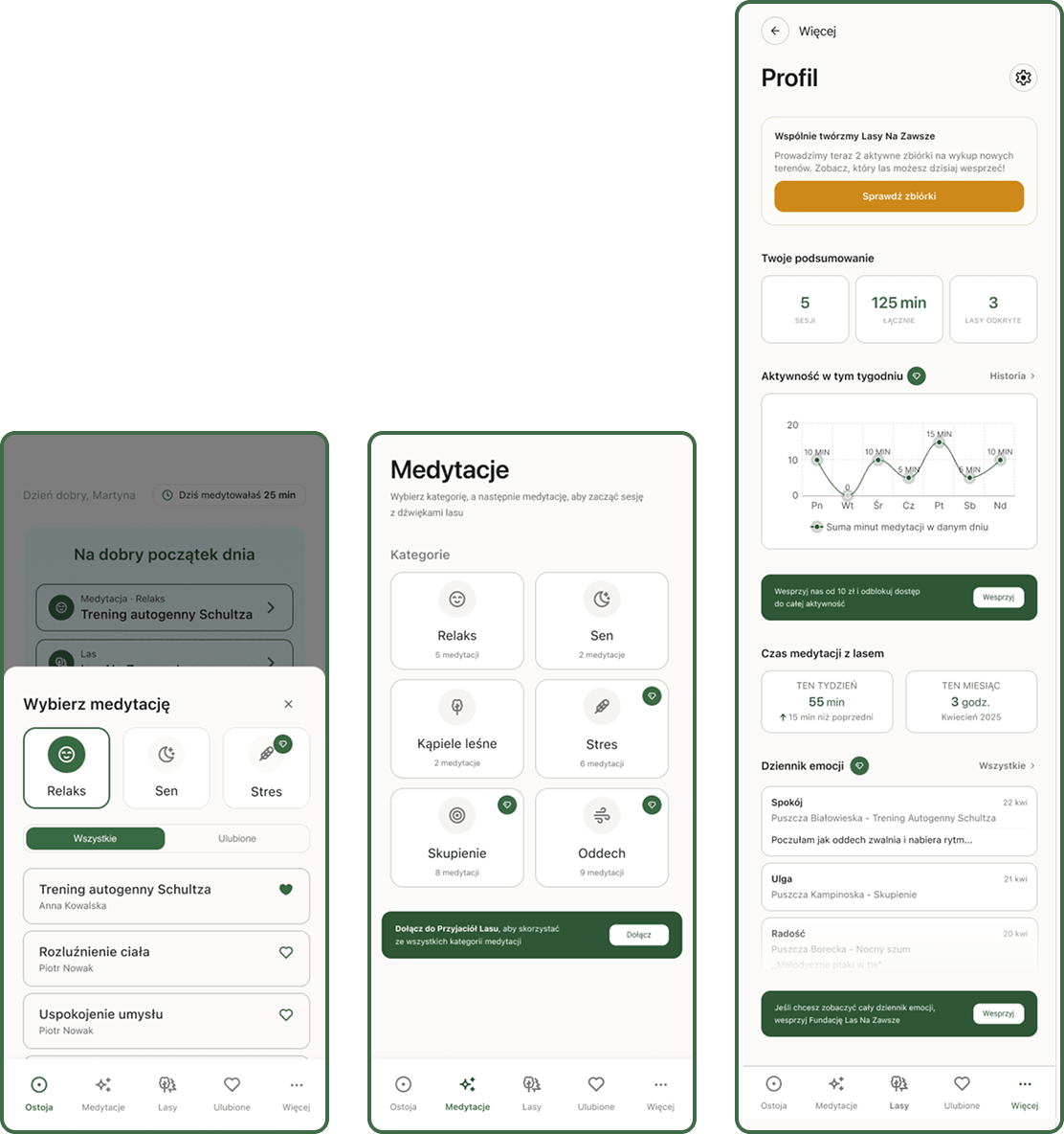
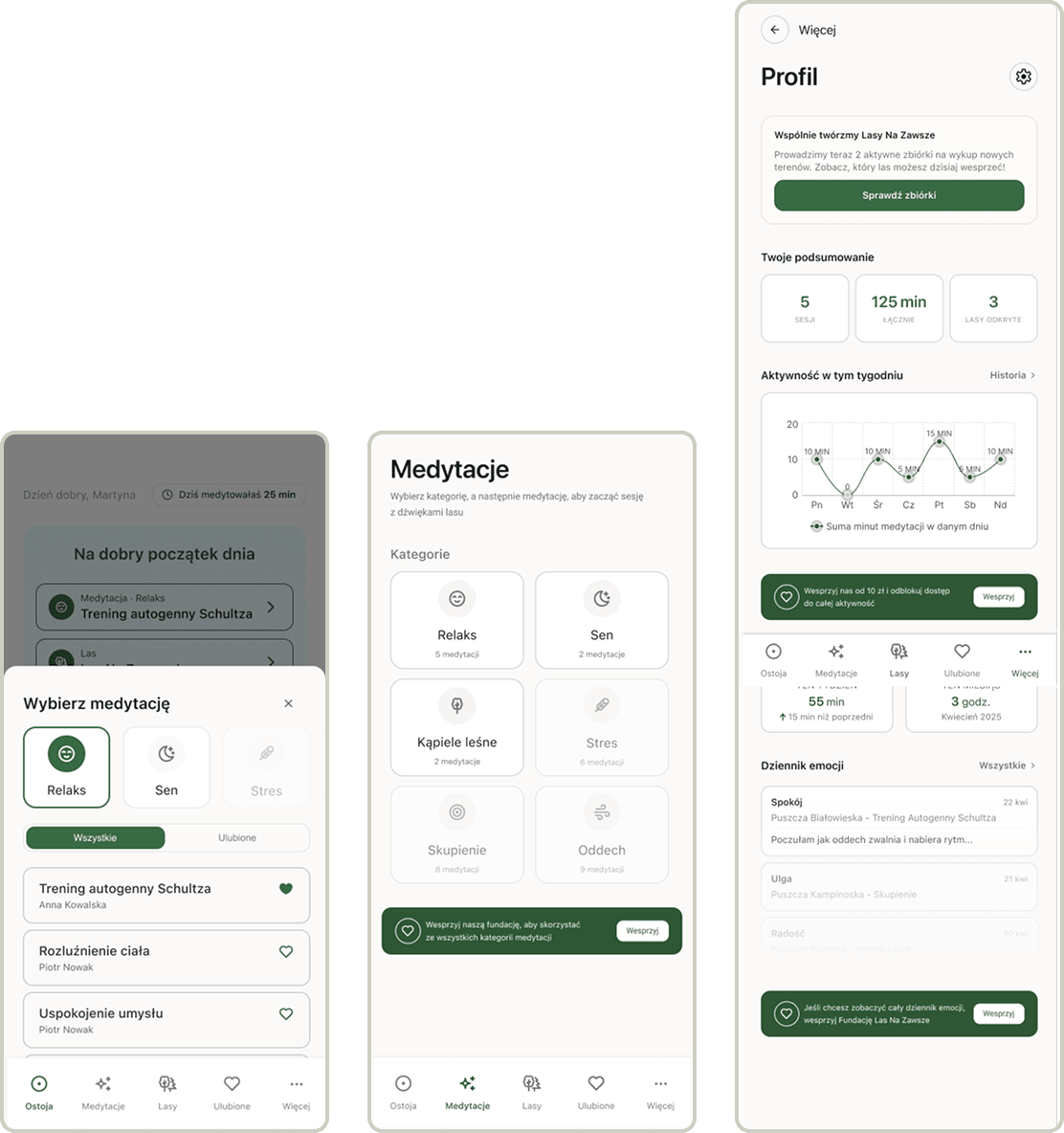
Two ways to support
replaced a small banner and a separate "active campaigns" section with a switcher that explains forest campaigns vs general support. Supporting the foundation is framed as co-creating the Połączona Puszcza Polska
Active campaigns
one dedicated colour across badges, map pins and filter; pulsing pin replaced with a gentle bounce
Premium features
diamond icon instead of greyed-out items, to spark curiosity instead of looking blocked
Support video after a session
the foundation's logo animates in before the video, the "Support" button is bigger and the close button sits top right
Impact
In July 2026 the foundation publicly presented Ostoja, the app project we designed for them. From what the foundation has told me, they plan to take it forward. The usability tests also shaped five changes and a list of recommendations for next iterations, including monetising forest bathing, rotating support videos and widgets. No usage or donation data - the app has not been released.
Prototype: Ostoja prototype (opens in a new tab)